
WSP with HEART is WSP’s new corporate social responsibility platform. In order to launch and to build internal interest, WSP with HEART needed an identity.
Heart icons are so common and I wanted to avoid tired clichés. To do this, I started a brainstorming session by sketching out a bunch of options. By pushing myself, I was able to get the clichés out of the way and to make space for a new take.
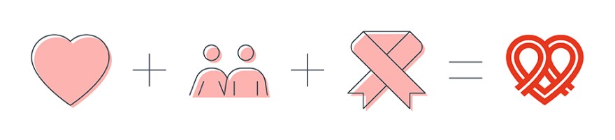
I pitched a handful of ideas and happily my favourite logomark was chosen. The concept behind the logomark above is empathy. You can see some signifiers that I baked in; a heart, two people coming together, and a ribbon.
To further give love and care to a worthy cause, I customised WSP’s corporate typeface, Styrene, into a logotype. Now, it has it’s own personality, while still looking like it belongs to the family.
