I designed the below WISE logo as an undergraduate project in 2009. I have grown as a designer and thought it would be interesting to see what I can do now.
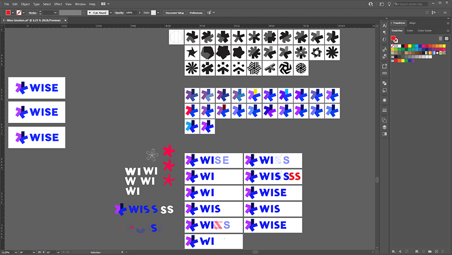
WISE built significant brand equity over the years and so I wanted to keep the original asterisk concept. Below is an image of the results of a brainstorming session.
Next, I made some quick mock-ups in Adobe Illustrator, which you can see below.
Below is a screenshot of Illustrator showing type design and colour exploration. I stayed with the original blue and purple colour scheme to protect brand equity, but modernised it.
Below is the full suite of responsive logos including all subsidiaries.
