
SBR is a Brisbane-based triathlon club and they were keen on a rebrand.
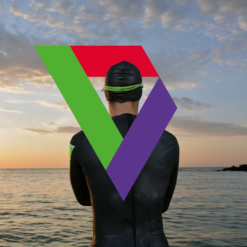
They had such great brand equity in the scene and I wanted to keep that. The broken triangle was important to the club as it represented each leg of the triathlon with a start and an end. I also refreshed the colours slightly to help them stand out.
I cleaned up the geometry and inverted the triangle to represent a winner’s medal, which my client loved.
